Minh Nguyet Truong- MA Graphic Design and Art Direction
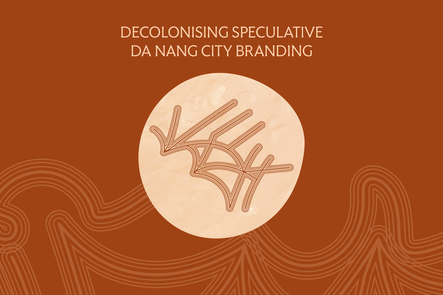
DECOLONISING SPECULATIVE DA NANG CITY BRANDING
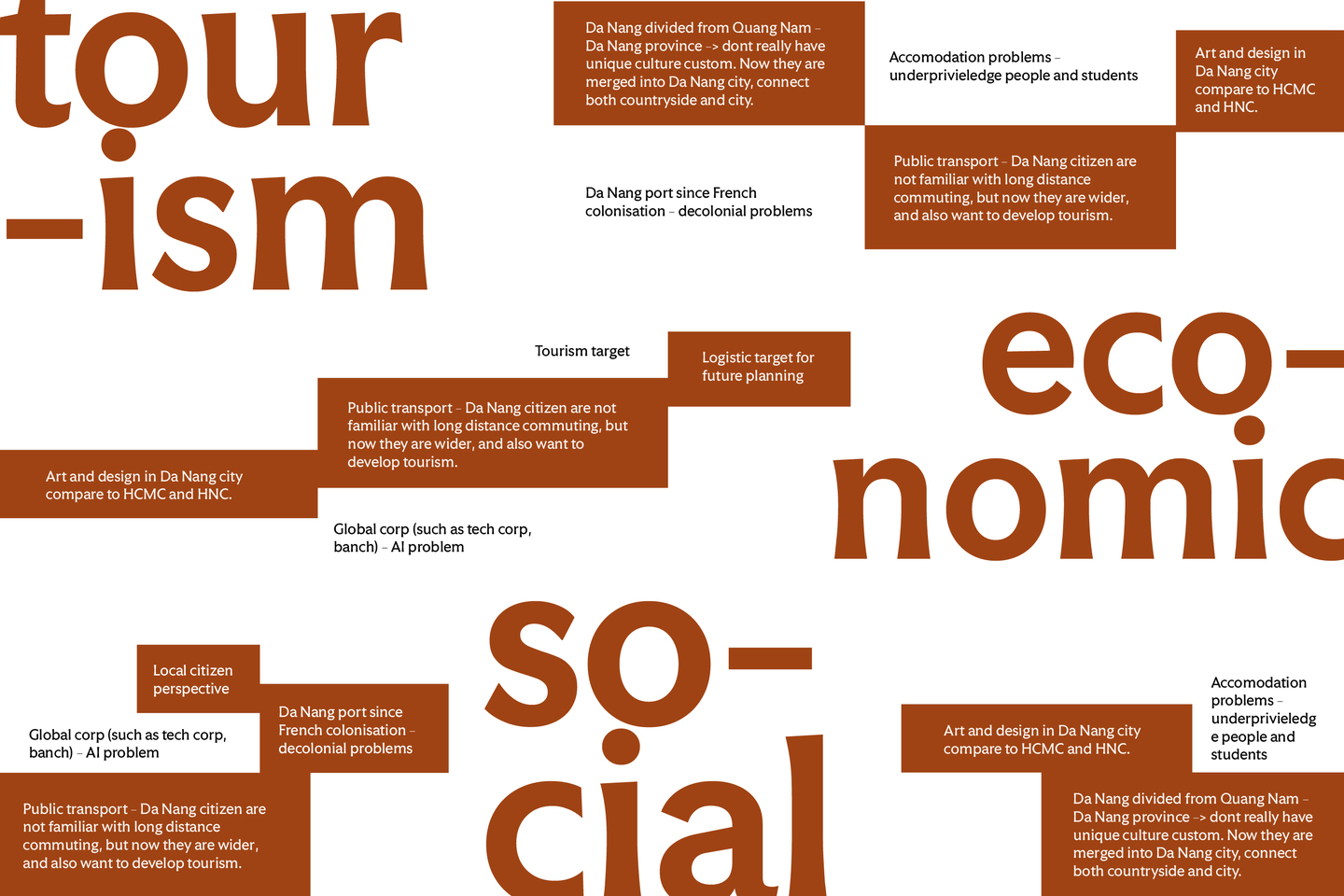
Da Nang - my home city - is sold to the world as a coastline: sea, sand, and sunlight, framed as "a cheaper version" of somewhere else. This image is not neutral - it is inherited power disguised as tourism, a single flattening story that erases everything behind the beach. This project asks a different question: who owns a city's identity - and who gets to decide its symbol?
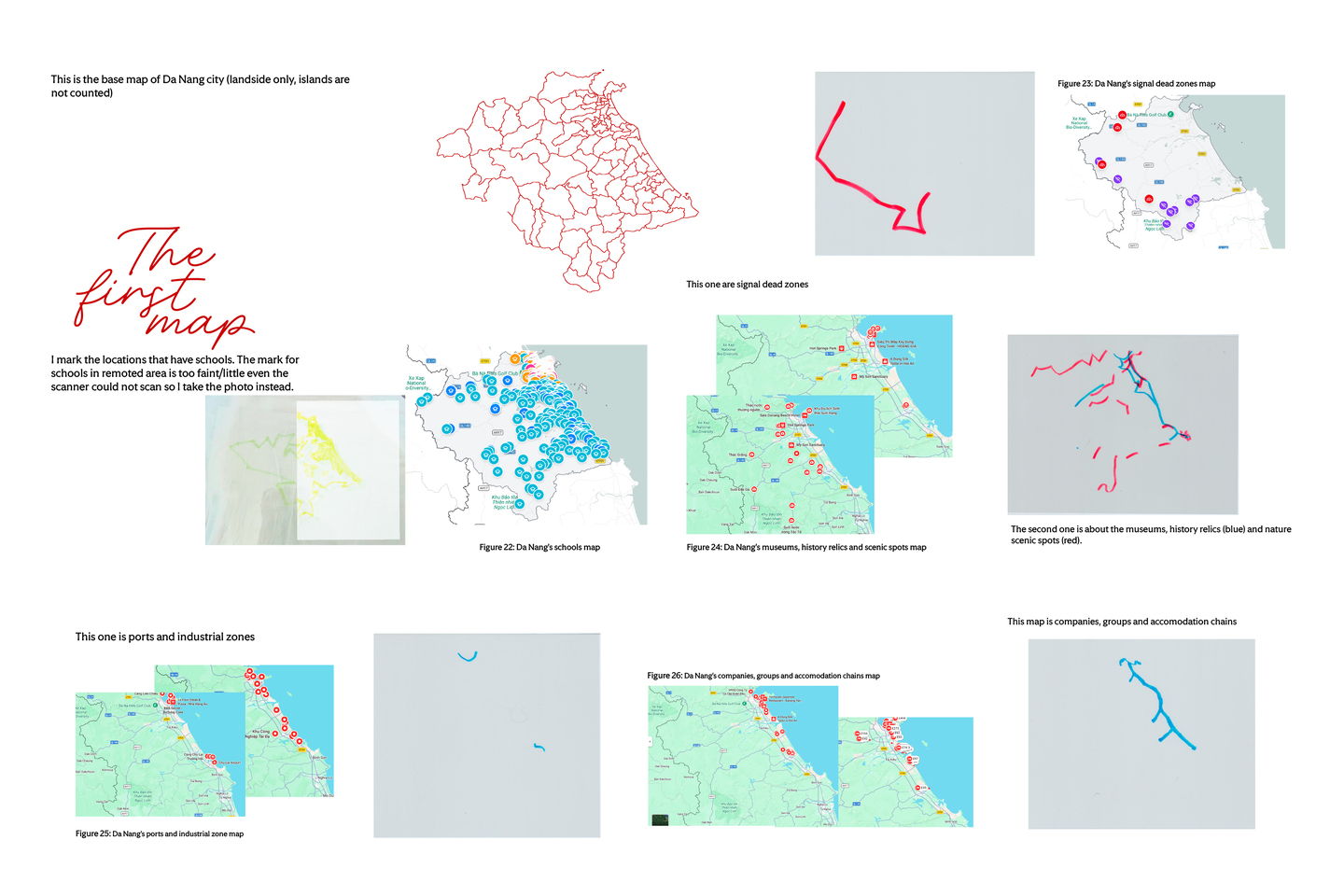
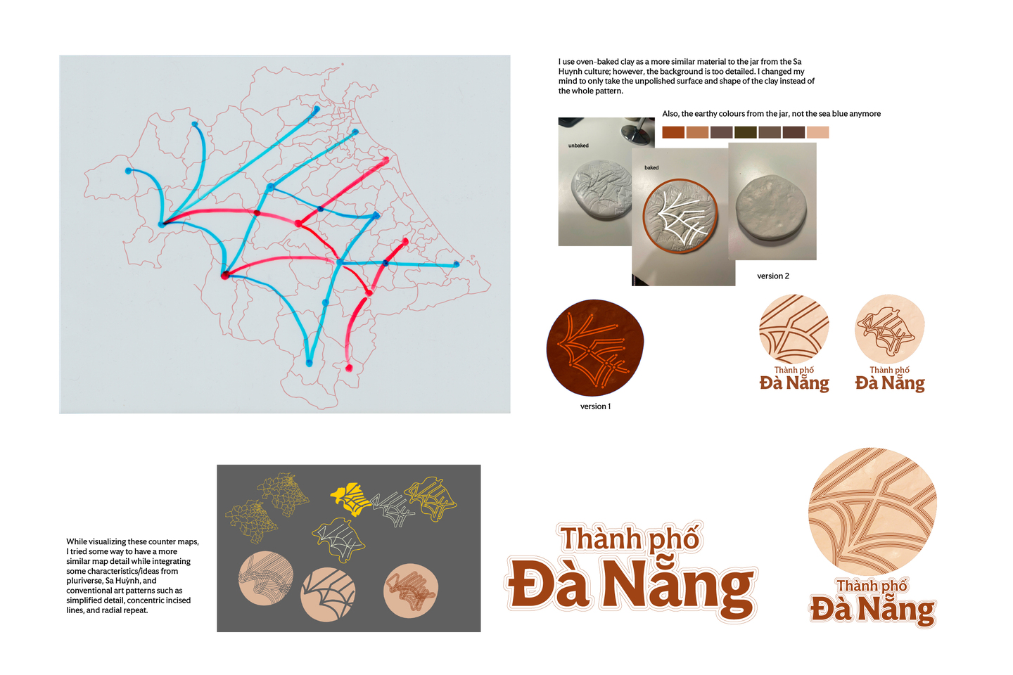
I mapped what the postcard forgets - the invisible layers of Da Nang: the dead zones disconnected from prosperity, the schools far from the shore, the workers who carry the city but never appear in its image. Layered like acetate sheets, these routes are not separate; they intersect, collide and coexist, revealing the city as many worlds rather than one. Then I connect them by the public transportation line, and then I recognised that the public transport s never just mobility.
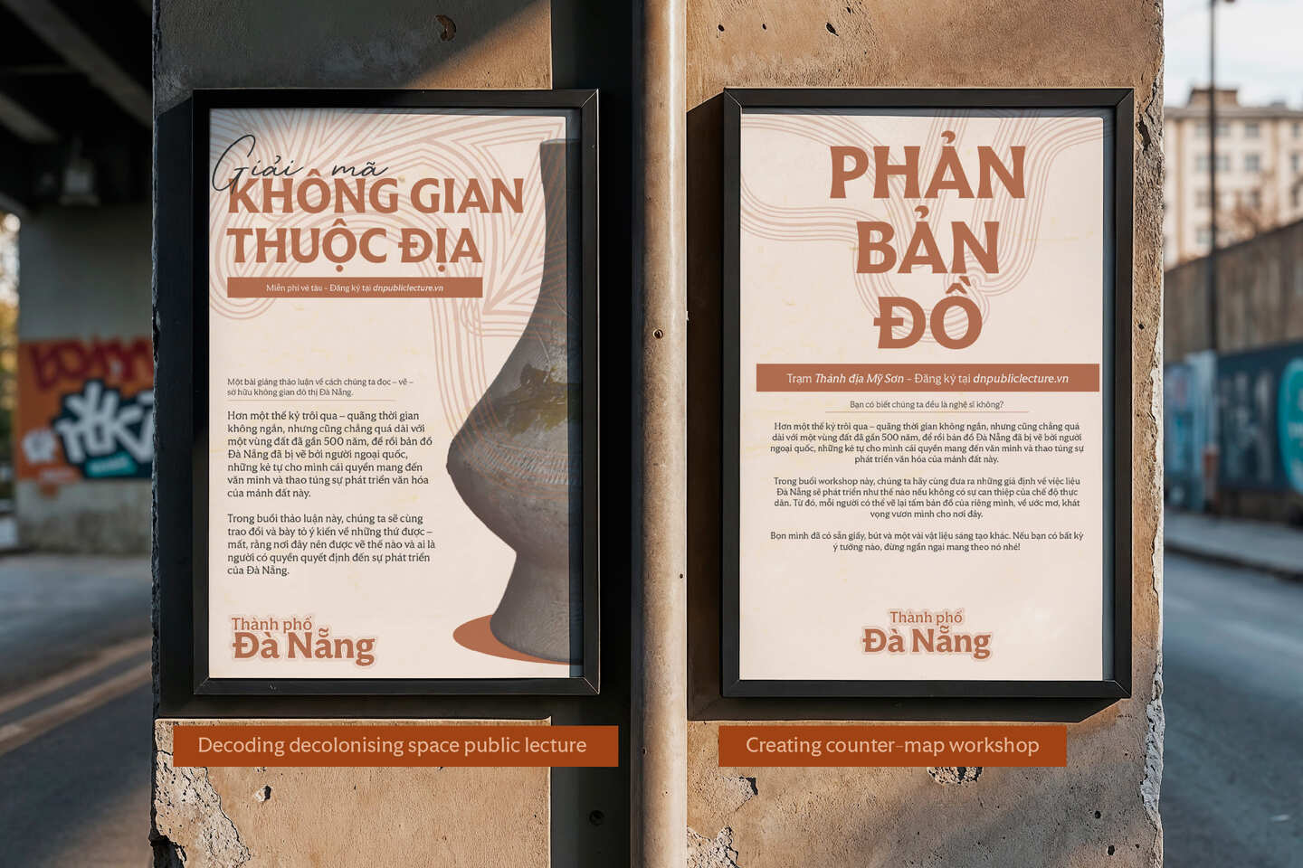
In this speculative plan, the public transportation map is the instrument through which the city redistributes economic power - pulling jobs and wealth away from the crowded coastline into the interior, so that the rental market cools down and housing becomes affordable again for those who serve the city. It becomes a climate buffer - keeping the burden for the city through disasters. And it becomes a distributed platform for culture and learning - stations as galleries and public lectures reach remote communities that have never had access to the centre.
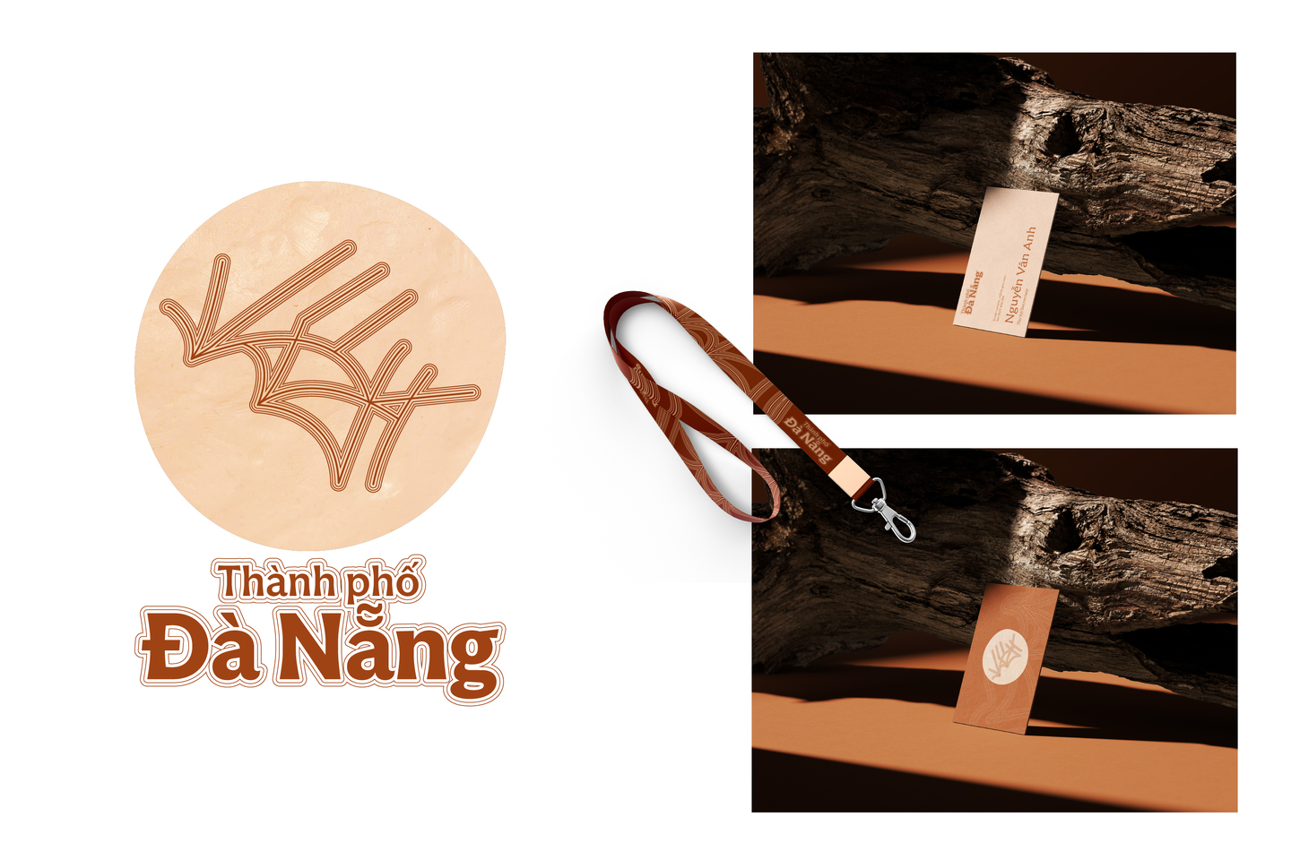
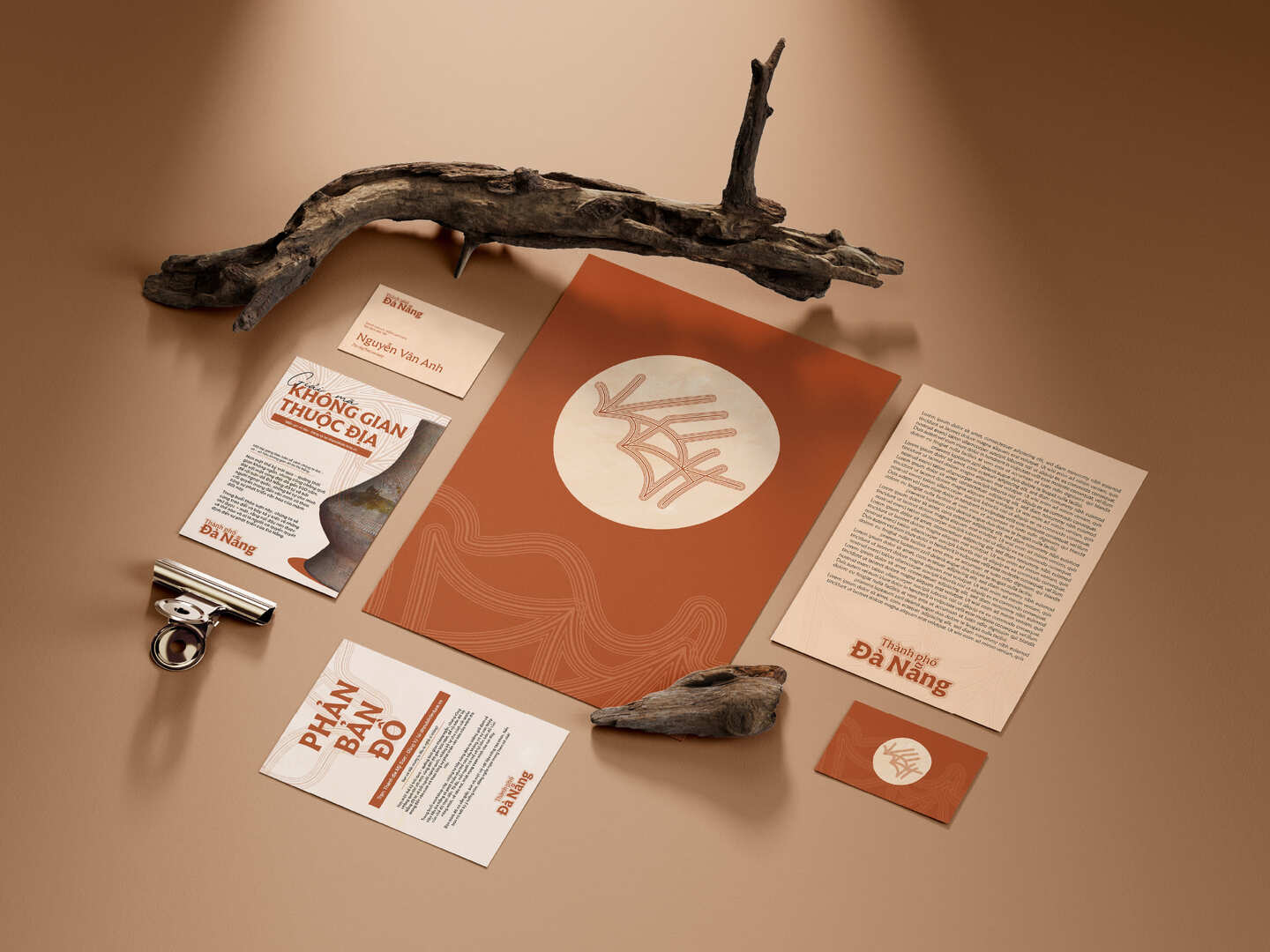
What the identity proposes is not a new image of the city, but a shared direction. A city that knows what it is working toward can grow its own strength rather than borrowing one. The logo at the centre of this project is not an endpoint - it is a medium. It does not tell people what Da Nang is; it gives them something to gather around. Workers, students, elders and the young may disagree, may see the city differently, may live generations apart - yet through a common visual language they can recognise that they are striving for the same thing.
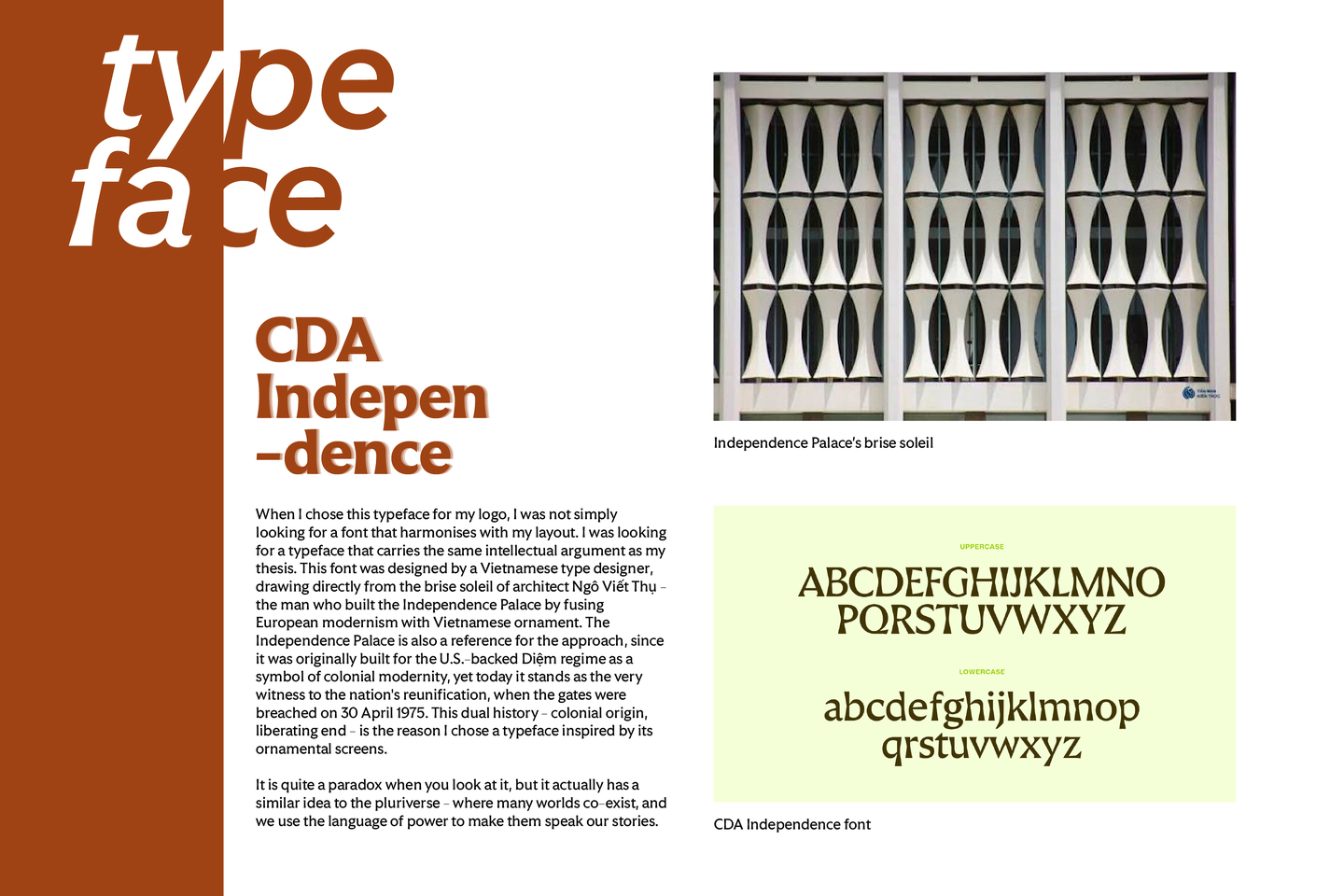
Typeface: CDA Independence by Collective Design Agency (CDA)